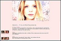
This was the first site layout launched in March 2003. My graphic skills were very limited and I stuck to a simple layout. I wanted soft, soft colours for Amber's beautiful face and I got that if little else.
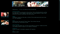
Version 1 only made it to April and v2 was glossy and black but still not very confident. I wanted shiny, high quality pics and could only find grainy screencaps of W/T so stuck to Aly + Amber photoshoots.
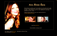
A TLH layout from v2 of the site. Getting Photoshop really started to make a difference to my graphics.
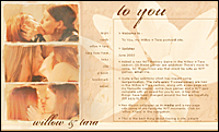
This version was my step out into i-frames and layers. I learnt a lot and the graphics are a bit more accomplished but beige and fawn are not my faves. Still, smoochies and Willow + Tara at last. I like this a lot more now than I did at the time.
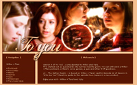
My first collage and I was really pleased with this layout but after almost 5 months it was time for a big change.
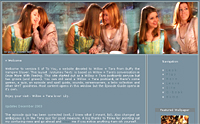
Version 5
A simple and clean layout that didn't last long. I really loved the header
image, which comes from a wallpaper I made.
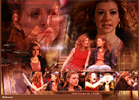
A big collage from Tough Love. I'd learnt to do lots of new stuff and even if this was a bit jam-packed visually, it was full of action which I really liked. Can't be all smoochy all of the time, lol.
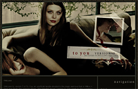
Version 6 was around for about 6 months and I really wanted a change - something breathtaking and lush. So I asked Ellissa from Educated Virgin to make a layout for me and she promptly said yes and whipped me up this in a couple of days - I'm in awe! I love her style and it was just the sort of thing I wanted, sexy and steamy instead of cutesy and dark colours at last.